
Pantone’s Color of the Year 2026, Cloud Dancer is doing quiet work right now. As a soft, warm ‘blilowy’ white with none of the clinical chill of true white, it’s become the neutral wall color
Pantone’s Color of the Year 2026, Cloud Dancer is doing quiet work right now. As a soft, warm ‘blilowy’ white with none of the clinical chill of true white, it’s become the neutral wall color of choice for anyone chasing a gallery-calm backdrop — and it turns out to be the perfect stage for greens and golds to make their entrance, particularly with oriental rugs. Against a flat, cool white, these tones can potentially read muddy. Against Cloud Dancer’s warmth—likened to natural linen or morning light—they glow.
Part of why this pairing works is that the two colors pull from opposite ends of the emotional spectrum. Gold has long read as a color of luxury — think gilt frames and brass fixtures. Green, by contrast, is one of the most earthy and natural colors on the wheel, rooted in forests and moss. Cloud Dancer sits neatly between the two: warm enough not to mute gold’s shine, soft enough not to compete with green’s calm. Together against that backdrop, a room gets grounding and glamour at once.
Interior designers have been leaning into this pairing for a while now. Karen Howes, CEO of Taylor Howes, has described emerald green as ‘unassumingly decadent’, saying it feels ‘luxurious without pretension’. Designer Van Noy suggests brushed gold lamp bases paired with green velvet pillows as an easy way to layer the two tones without the room feeling matchy-matchy. Both takes share the same restraint: white does the neutral work, and green and gold do the talking.
Not every green pairs with gold the same way. Designers generally point to deeper, richer shades — emerald, forest, and olive — as gold’s best match, rather than fresher, brighter greens like mint or lime, which tend to compete with metallic warmth instead of complementing it. Gold is warm; deeper greens carry enough of their own warmth to sit alongside it rather than being overpowered.
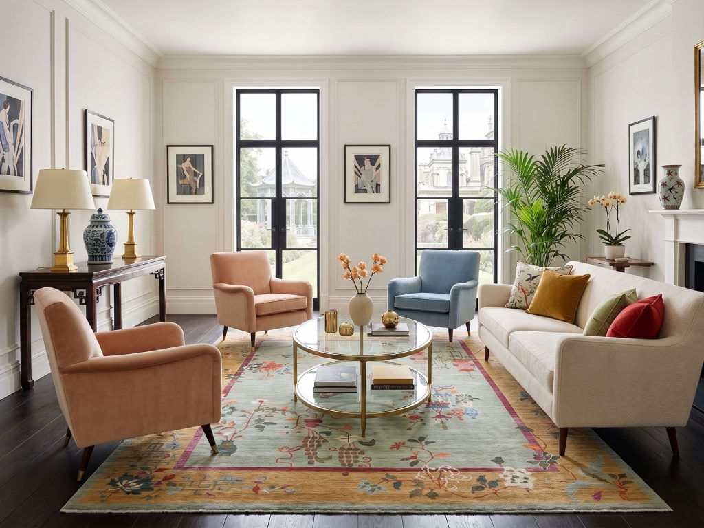
Some rugs build the pairing directly into the pattern. Our Pistachio Green Chinese Art Deco Inspired Peshawar (SH22455) sets a soft pistachio field against a gold border, with hits of red, peach, pink, blue, and ivory woven through — hand-knotted in wool with vegetable dyes. Against Cloud Dancer walls, the gold border acts like a picture frame, containing the green so it reads as intentional rather than accidental.
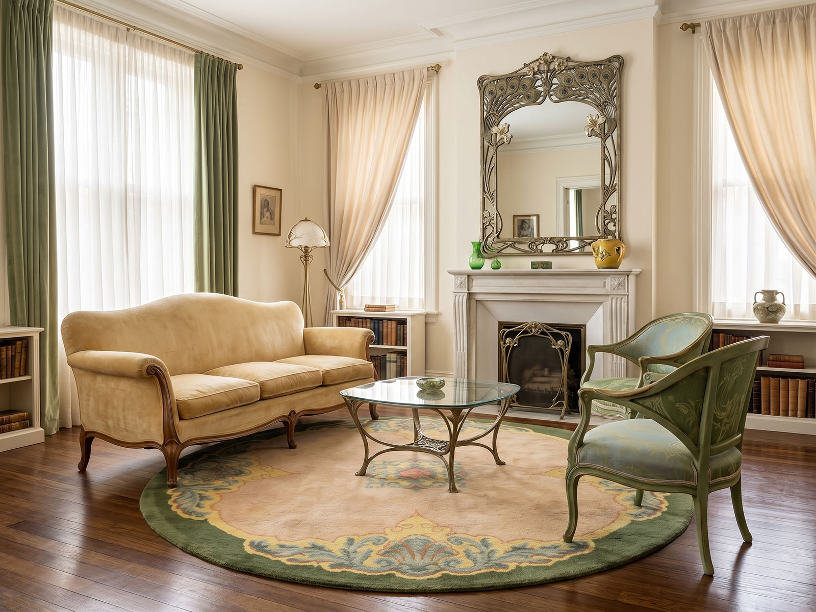
Then there’s a subtler, more historical version of the pairing. Our antique Art Nouveau Holland-made Savonnerie (SH78632), a round, hand-knotted wool rug from the 1930s, has a warm beige field edged in a green border, with soft yellow and light blue running through it. It’s not gold in the strict sense — closer to a warm, aged yellow — but it carries the same effect: a quiet, antique glow that keeps the green from feeling too cool.
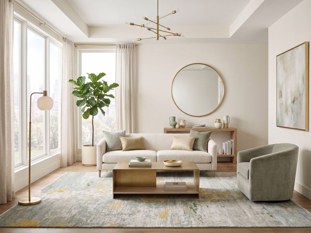
For something more contemporary, our Sage Green Modern Abstract rug (SH22886), hand-knotted in pure Afghan wool, pairs its sage field with gold, beige, and ivory in a loose, abstract design. Set against Cloud Dancer, the gold reads almost like scattered light across the green — proof that this pairing doesn’t need a traditional pattern to work.
Beyond rugs, the same logic shows up in kitchens with brass hardware against sage cabinetry, living rooms with a gold-framed mirror above a moss-green sofa, and dining rooms where gilt-edged china sits on white linen.
Greens and golds are both warm-leaning tones, and Cloud Dancer’s own warmth means neither has to fight the wall to feel intentional. It’s less about matching and more about letting the room’s neutral do what a neutral is supposed to do: get out of the way and let the good stuff pop